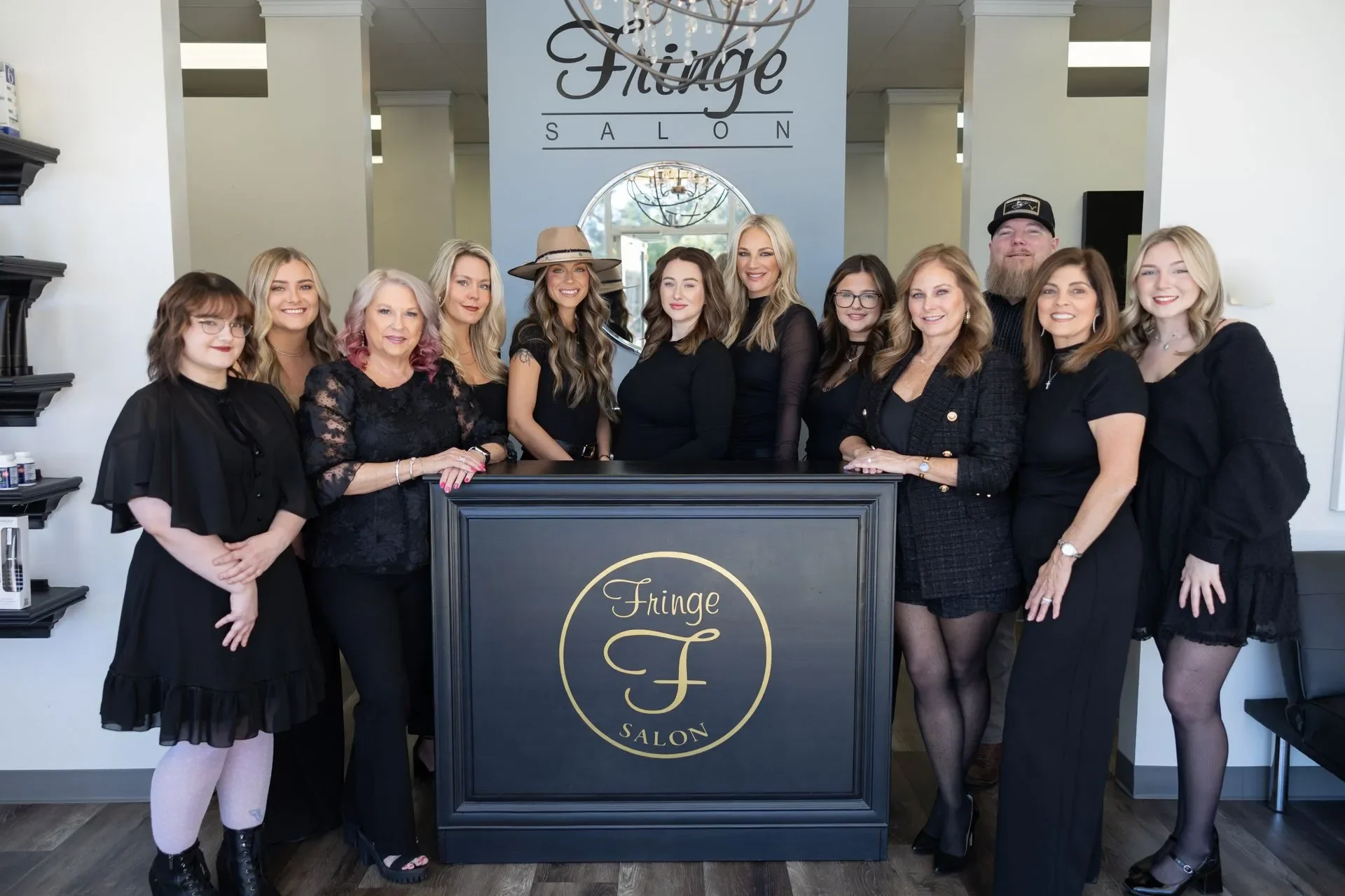
Fringe Salon:
t-shirt designs
Project Summary
This project involved designing a series of custom t-shirts for Fringe Salon that reflected the brand’s luxury-meets-approachability identity while remaining wearable, printable, and retail-ready. The goal was to create pieces that function both as staff apparel and client-facing merchandise.
cLIENT
Fringe Salon
TIMELINE
2 weeks
PROJECT TYPE
Apparel Design
TOOLS
Adobe Illustrator
Brand Identity
Modern, elevated, slightly playful
Beauty-forward without being trend-chasing
Local, personable, but polished
Project goals
Align with Fringe’s existing visual identity
Maintain legibility and visual impact from a distance
Create Merchandise that is both stylish enough for the stylists to wear, and advertises the brand
Design Concept and Inspiration
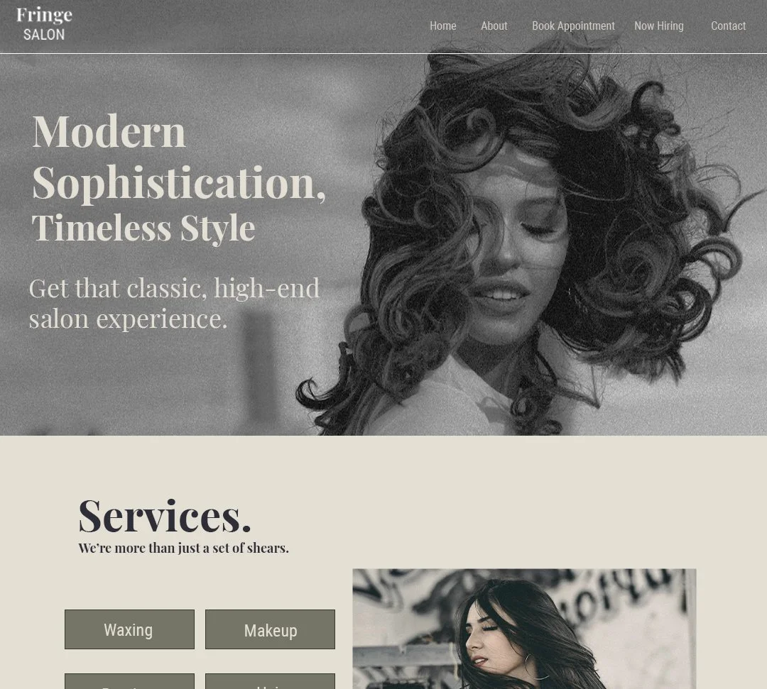
When it came to designing these shirts, i fell back on the previous work I had done for Fringe Salon as a way to keep the branding and visual identity consistent. When designing their website, I had primarily taken inspiration from two sources:
Vintage cosmetic packaging
Editorial fashion typography
hat this meant was that the colors needed to be natural and subdued, but the typography, composition, and shape language needed to be high-impact. Clean lines, shapes, and lettering that stood out from far away was a necessity, and would provide balance to the softer color palette. The overall effect was a visual language that communicated a demand for attention through order and class, rather than chaos.
Visual system
Typography
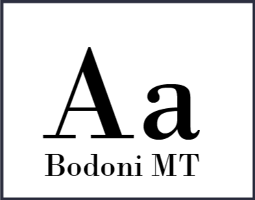
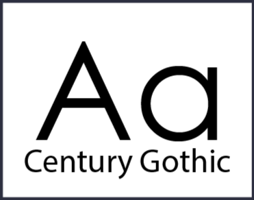
Bodoni MT was chosen as the primary font for this project as it resembled vintage print typography, and had bold, interesting forms. Smaller text would be in Century Gothic due to it’s uniform spacing and strokes making it more legible. Arial Rounded was selected for one shirt in particular, at the client’s request.
Color palette
#FFFFFF#A0A18F#EFEBE0#292B3FThe colors chosen here were taken directly from the website I developed for Fringe Salon. Due to this being a physical print project, i had to limit the colors I used to under 6. I ultimately decided on a neutral color, a more vibrant accent color, a light accent, and a dark accent.
lAYOUT
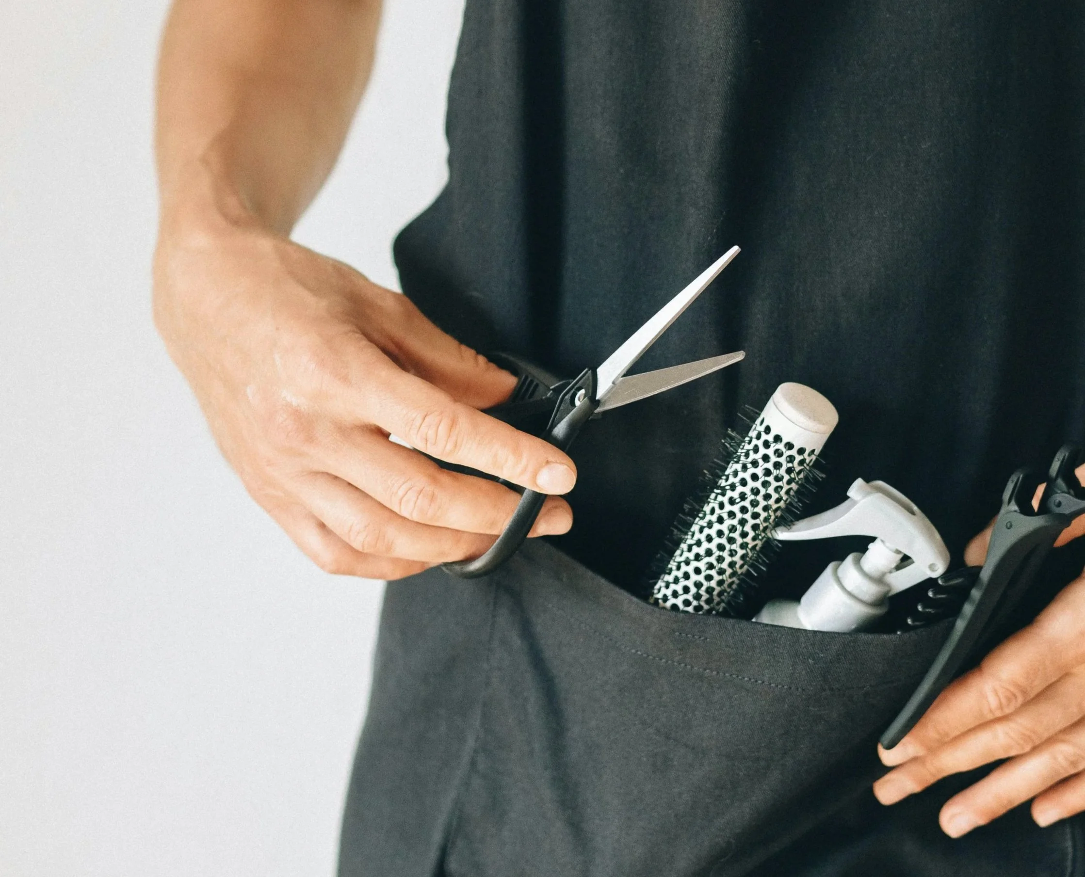
As stylists wear aprons while working, it was decided that the designs would go on the back of the shirts, with a small logo reserved for the front
Iteration & refinement
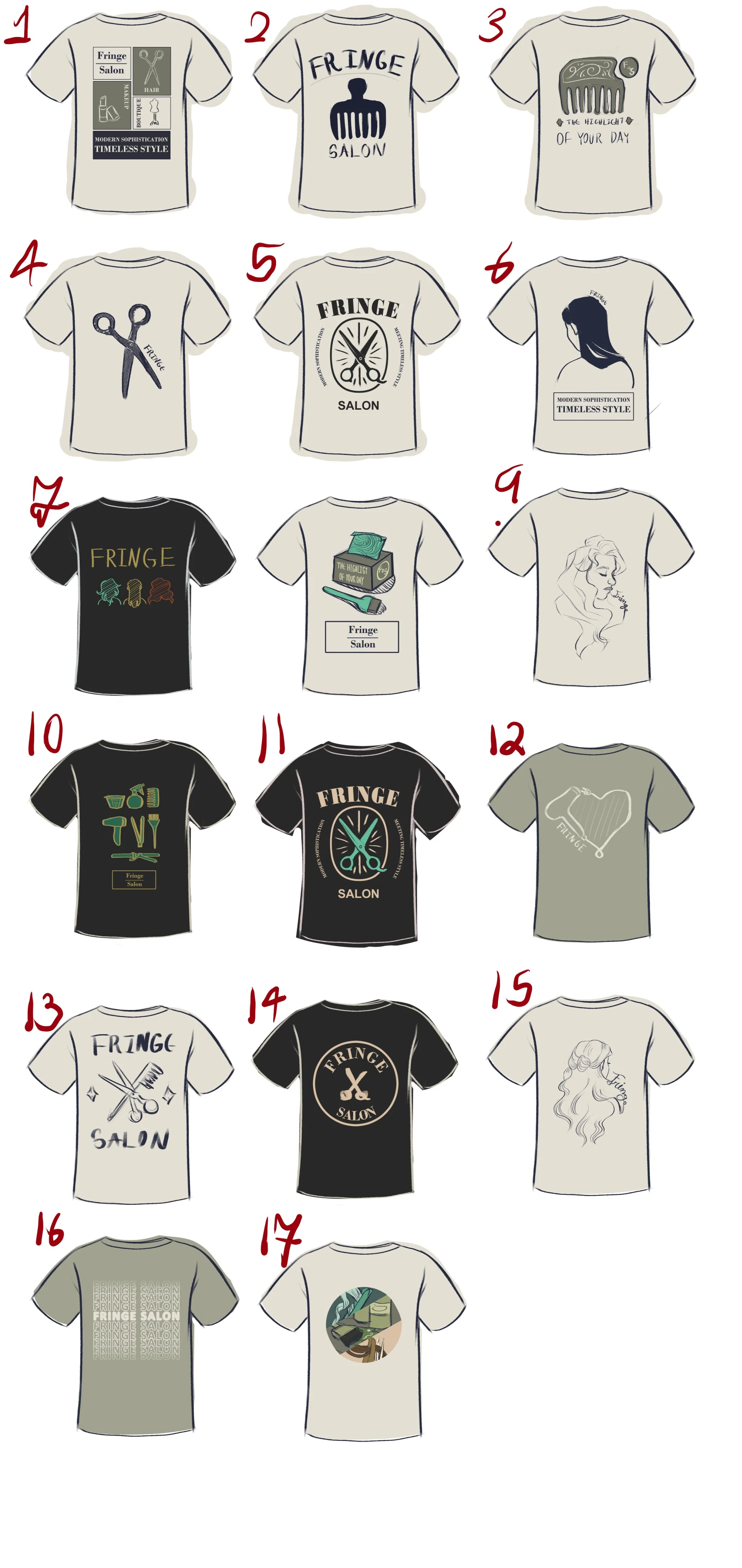
1. Brainstorming
A collection of 17 sketches were quickly produced for the client to give notes on and select 3 favorites for refinement. I also produced a concept for what the small logo that would be placed on the chest might look like.
2. Sketch refinment
The client delivered notes on the three designs they wanted finalized. I used these to create cleaned up sketches that would almost identically reflect what the final files would look like. It was also decided they would simply prefer the salon name for the chest logo.
4. Deliverables Created
Once the refined sketches were approved by the client, I used them as templates in Adobe Illustrator to produce the final deliverables.
3. Print House Scouted
As my client is a small business owner who admitted to having little understanding of how print production works, I did her the courtesy of scoping out a suitable print house. This ended up being The Ink Spot. Their FAQ let me know I needed the deliverables to be .ai.
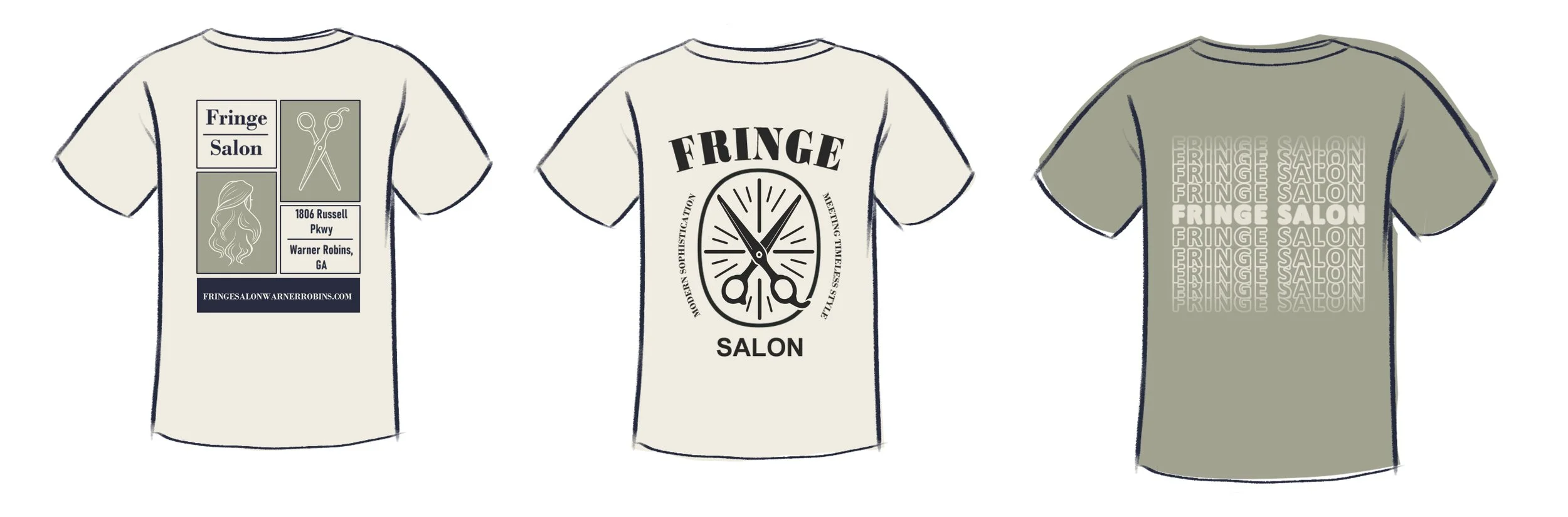
The Final Deliverables
-
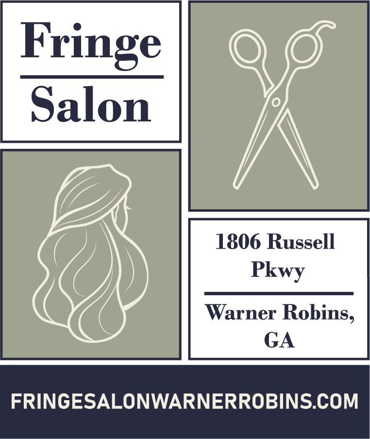
Block Pattern Shirt
This shirt was specifically designed with the owners in mind. The client wanted something they could wear to marketing events that would advertise the salon while still looking stylish. The bold, structured blocks catch attention without being garish while the simple, clean lines that compose the pictures help communicate the simple elegance of the brand.
-
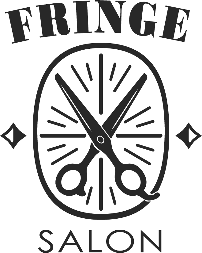
Scissor Logo Shirt
I developed this shirt with the idea that there should be a more image-heavy design. I created one that would feel smooth— the circle, radial lines, and curved top text create a flow for the eye to follow. At the same time, the angular diamonds and straight “salon” provide clean structure.
-
Layered Text Shirt
This was arguably the simplest shirt created, and was created for stylists who might not favor bold visuals. The gradient naturally leads the eye to the salon name in a way that feels more natural than simply placing it in the center on it’s own.
Reflections
One of the most valuable lessons from this project was learning how restraint strengthens brand work. Early concepts leaned more illustrative and expressive, but through refinement it became clear that the strongest designs were the ones that trusted typography, spacing, and proportion to do the heavy lifting. By reducing visual noise, the final shirts felt more aligned with Fringe’s elevated but approachable identity and more likely to remain relevant over time rather than tied to a single trend.
Designing apparel for Fringe Salon challenged me to think beyond aesthetics and into longevity, wearability, and production realities. Unlike digital design, where iteration can continue indefinitely, t-shirt design forces early decisions to hold up across fabric, bodies, lighting, and repeated use. Every choice needed to survive the real world.