Fringe
Rebranding
UI/Ux design, branding
A complete brand overhaul and website refresh for fringe Salon.
Timeline
6 weeks
Fringe Salon
Client
2025
Year
Photoshop, Adobe Illustrator, Mockflow, GitHub, VS Code
Tools
The Brief
Fringe is a higher-class salon that employs a team of experienced professionals whom provide clients with a luxury salon experience. While traditionally catering to the demographic of women ages 35+, it has recently begun to employ a series of younger hairdressers who specialize in more trendy and alternative styles.
Despite its status as a luxury salon, the website for Fringe fails to convey this brand image. It possesses an outdated royal blue and white color scheme with inconsistent and overly playful fonts. Beyond this, the website’s layout features numerous pages with overlapping information, misaligned elements, and multiple opportunities for accessibility improvements.
The Solution
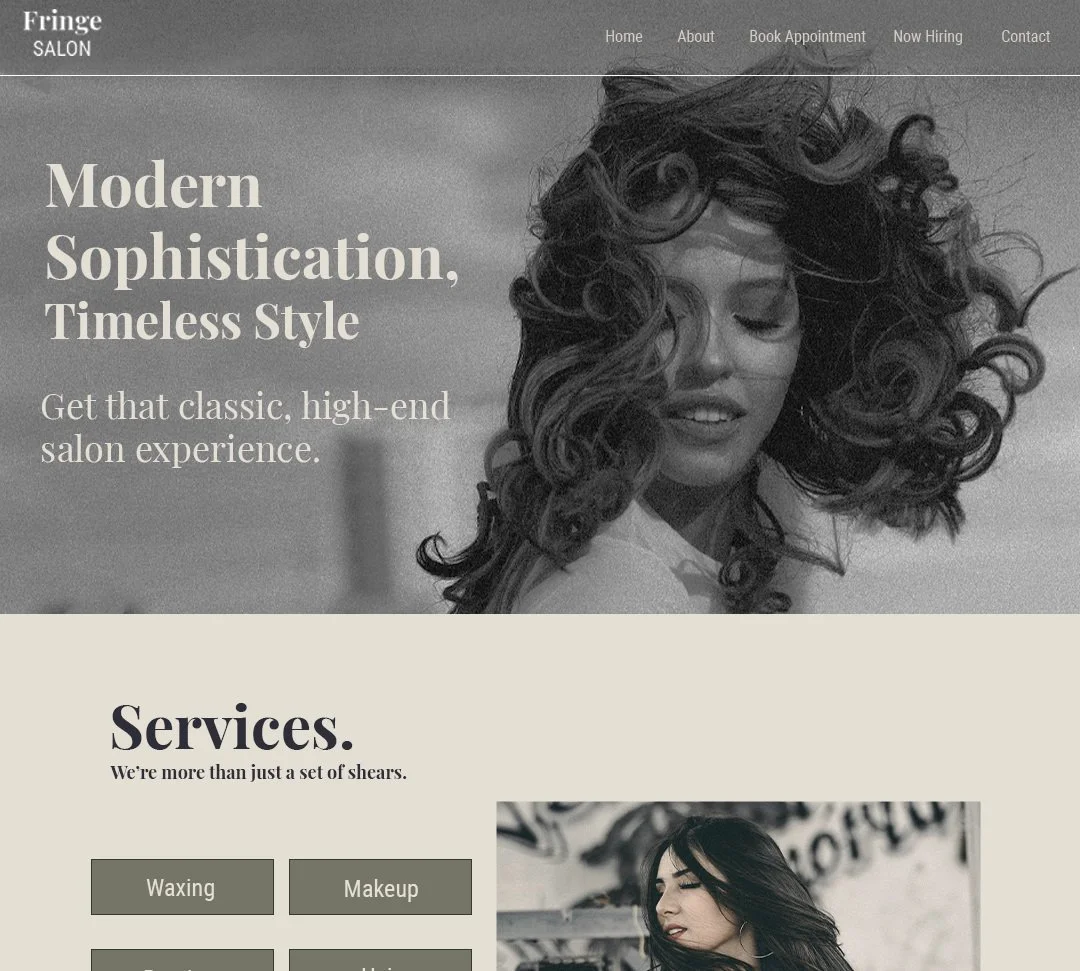
My solution was to modernize the site by reworking it from the ground up and implementing a sleek, sophisticated design with a refined color palette that more closely aligns with the salon’s other marketing avenues. Cohesion was be brought to the typography, and the layout was changed to appear cleaner and more intentional. Beyond that, accessibility improvements such as proper alt text and keyboard navigation were incorporated. time was also taken to condense the information present within the website to eliminate overlapping info and reduce the amount of clicking users need to do to find relevant information.
Deliverables
Wireframes for 3 screen sizes
Mockups for 3 screen sizes
The fully coded and operational website
Branding
Before any work could begin on the website, some major changes needed to be made to the way Fringe presented themselves online. Extensive research was done into the target demographics of the salon.
Audience
1
Primary Audience: Women ages 35-65
Secondary Audience: Women ages 18-25
Design Appeal
2
Retroism
Minimalism
Clean and streamlined
Authentic and realistic
wEB appeal
3
Best Stuff First
Large, High-Quality Images
Large Typography
Every event we host is designed with intention, from the atmosphere we create to the way each session flows.
Tone and image
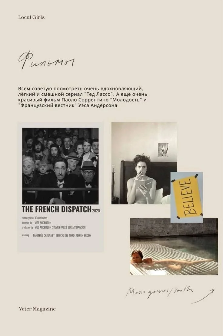
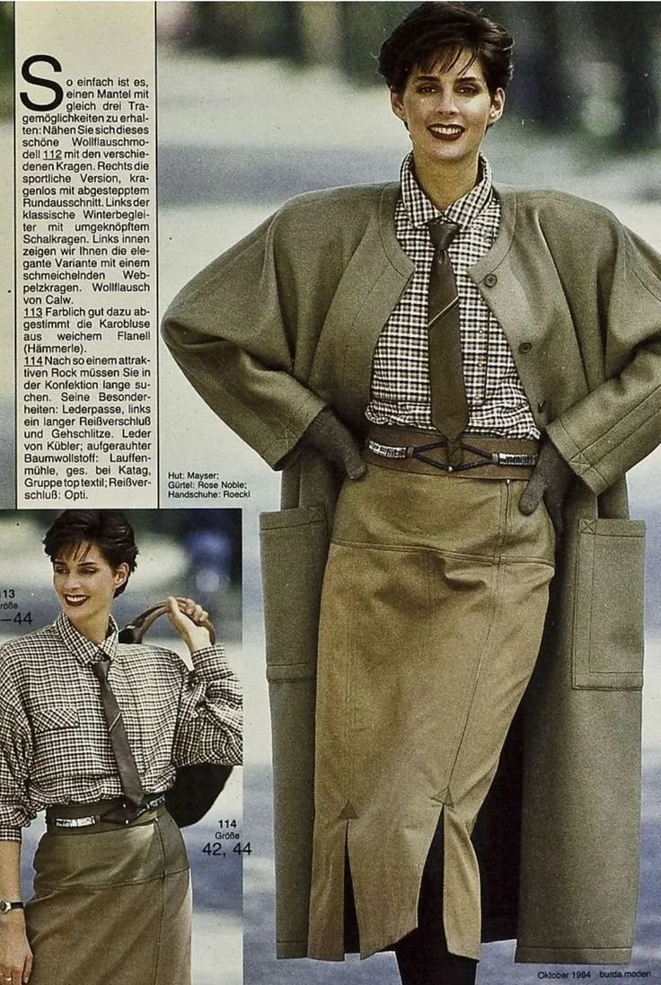
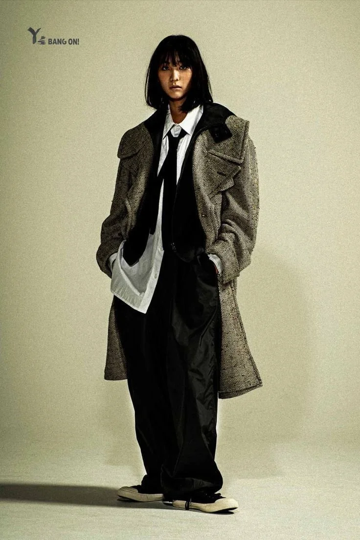
The overall brand image I crafted was one that appeals lightly to the retro sensibilities of our target demographics by invoking the idea of older magazine models and cinema photography. The design should communicate a sort of quiet luxury that’s almost editorial and lets clients know that this is a high end experience, but avoids coming off as off putting or show-boating. It should project the image of being a high-end performance of self-care that’s trendy and up to date.
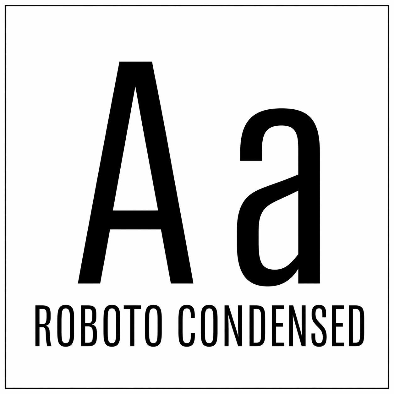
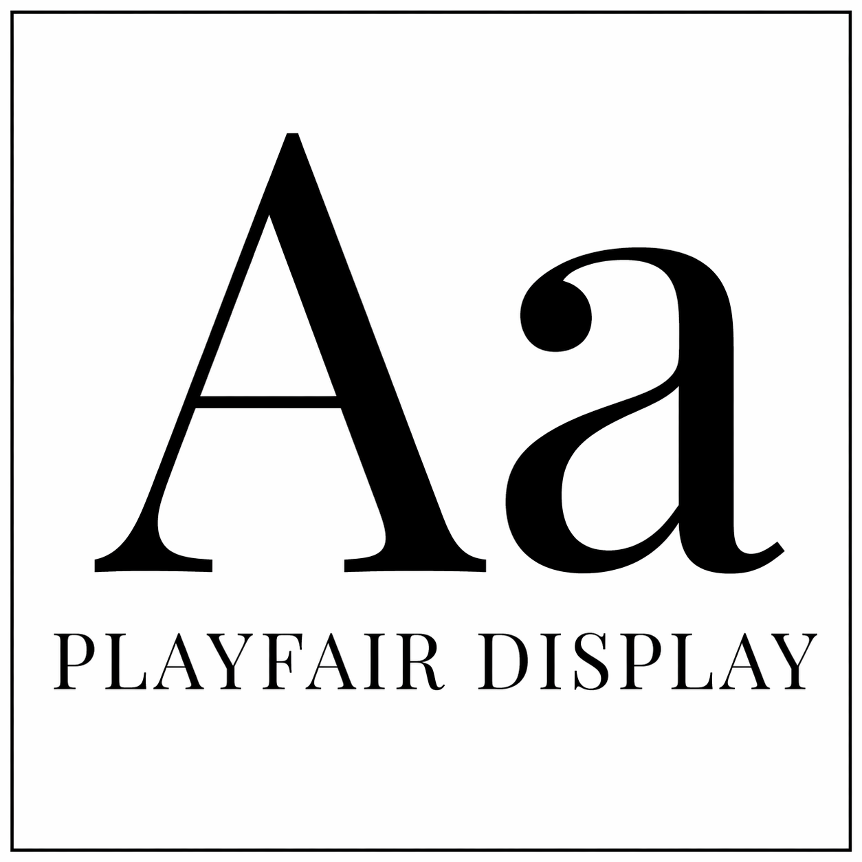
Visual System
Typography
Color palette
#A0A18F#FFFFFF#292B3F#EFEBE0Streamlining User experience.
One of fringe’s biggest barriers to achieving new clients was a site architecture that felt more like a labyrinth than a guided tour of the brand. Fixing this issue required identifying repeated information, consolidating which information could be grouped together instead of being on different pages, and figuring out what content belonged on the home page. The changes I made were as follows:
-
The "About" page contained a lot of information that would really work better when highlighted on the homepage. I felt a salon should have it’s offered services shown front and center.
-
Information that was repeated nearly every page was moved to the footer, which is where people will often look first when trying to find basic details about a business. This info included:
Address
Contact info
Business Hours
Accepted Payment
-
Due to the contact page containing a lot of information already moved to the footer, I placed the form there as well.
-
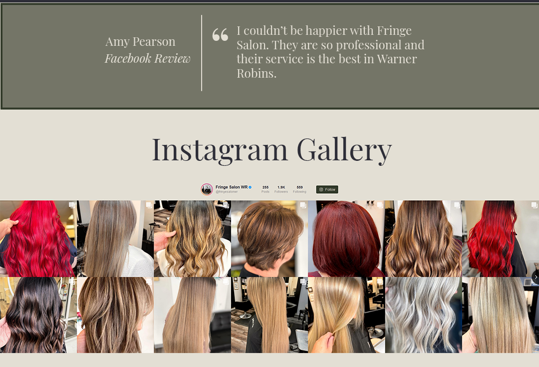
The current Gallery page added an entire page to the website, just to display a grid of 8 images of the salon’s interior. I decided to remove this entirely and add an Instagram feed to the homepage. Seeing the work the salon produces seemed much more relevant to me.
-
Moving this to the “Home” page allowed me to create an about section that also contained the Salon’s mission statement.
-
I moved the testimonial from the “Salon Services” page to the “Home” page, placing it under the About section. I felt this provided a nice cap to the About section by reinforcing what was said with a good review.
Development & Implementation
I built the site using a structured, component-based workflow that prioritized semantic HTML, scalable styling, and responsive performance across devices.
The development process followed a clear sequence:
Semantic HTML structure
Global styling and design tokens
Mobile-first layout implementation
Desktop refinement and responsive tuning
JavaScript validation and interaction
This workflow ensured consistency, maintainability, and accessibility throughout the build.
During development, I made several structural improvements to enhance semantic clarity. For example, stylist profiles were refactored from generic sections into properly structured articles with figure elements, improving both accessibility and content hierarchy.
Global styles were designed using reusable variables and utility classes, allowing design updates to be applied consistently across the site. Later refinements focused on consolidating repeated styles, reducing code complexity, and improving layout stability.
Responsive behavior was refined by introducing an additional breakpoint at 768px, improving spacing, alignment, and visual balance across screen sizes.
Interactive enhancements were added to improve usability and polish, including:
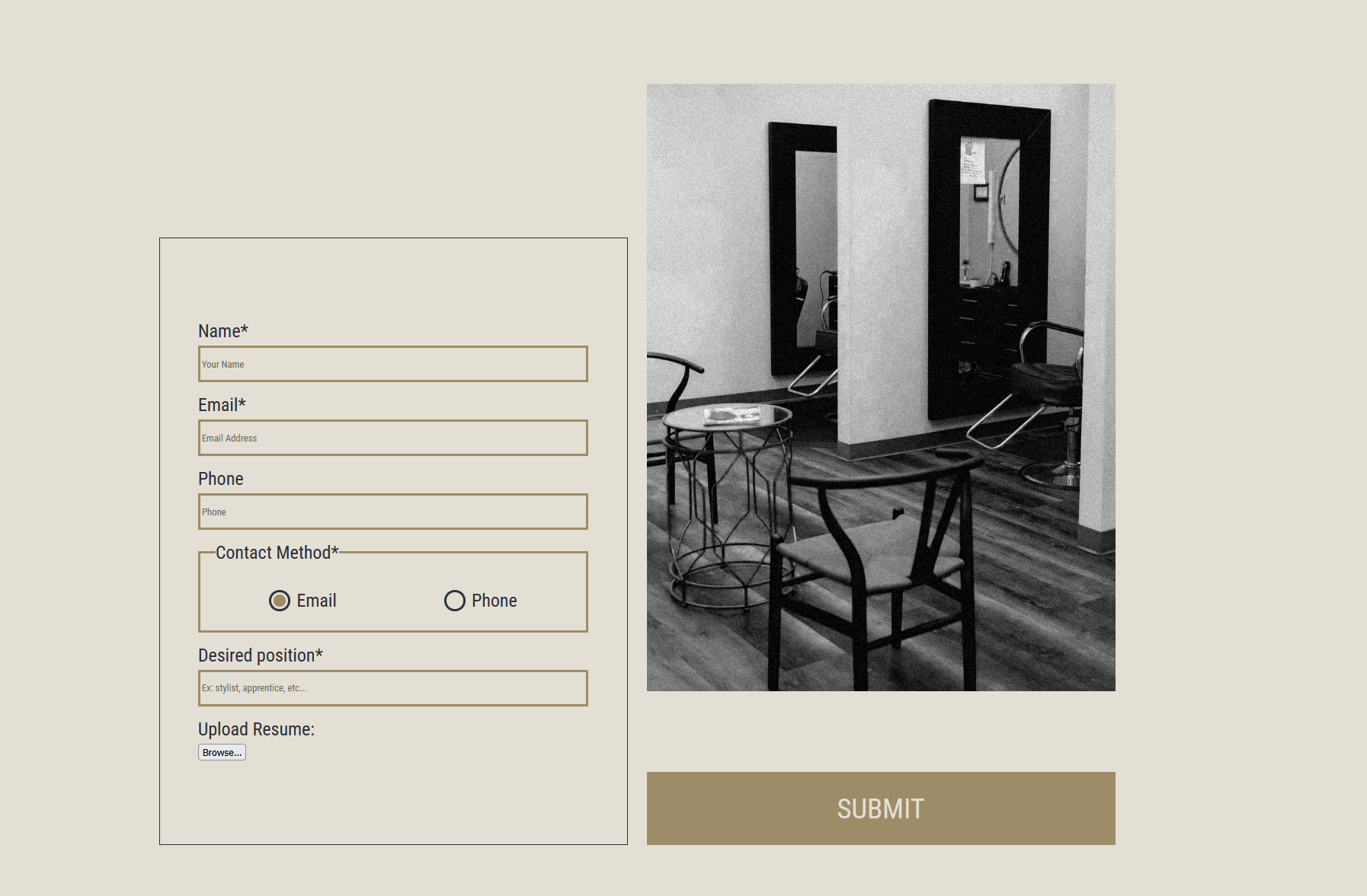
Form validation with dynamic error messaging
Hover and active state feedback for navigation and buttons
A responsive header that transitions from transparent to solid during scroll
These refinements improved both usability and perceived performance, resulting in a more polished and professional user experience.
Reflections & Impact
The final refinements focused on improving clarity, responsiveness, and usability across devices. Small structural and visual adjustments produced measurable improvements in readability and interaction.
Performance & Code Quality Improvements
Reduced CSS file size by approximately 80 lines through consolidation of repeated styles
Introduced reusable utility classes to improve scalability and consistency
Added a mid-size responsive breakpoint to improve layout stability across devices
Reduced layout conflicts and visual bugs through structural refactoring
These changes improved responsiveness, simplified future maintenance, and created a more efficient styling system.
Impact on User Experience
Increased spacing and padding to improve readability and visual balance
Improved button visibility in the contact section through contrast adjustments
Introduction of a responsive header behavior to reduce navigation friction during scrolling
Added hover and active state feedback to improve interaction clarity
These changes resulted in a cleaner, more navigable interface that better supports users across screen sizes and interaction contexts.
Accessibility & Interaction Improvements
Improved semantic structure for content hierarchy
Increased font sizes and simplified typography for readability
Enhanced form validation with clear error messaging
Standardized interactive feedback for buttons and navigation elements
These adjustments improved clarity, reduced user friction, and supported a more inclusive browsing experience.
The Impact
Through iterative refinement and testing, I improved the site’s usability, responsiveness, and maintainability by optimizing styles, refining responsive behavior, and enhancing interactive feedback. The result was a cleaner, more reliable experience that is expected to elevate the salon’s digital presence, improved customer confidence, and make it easier for visitors to explore services and take action, directly supporting client acquisition and day-to-day business operations.